Settling into a new home is both exciting and overwhelming for buyers. Whether putting down roots for the first time or the fifth time, whether a new construction or an existing property, turning this blank slate into the perfect home can seem like a never-ending project. As many feel rushed to complete the job, it is easy to make some common mistakes when installing furniture and decor. Fortunately, most are easily avoidable with a little planning and thoughtfulness.
Today’s luxury homes often include hardwood floors that are both beautiful and convenient. Adding an area rug to create depth is standard practice but homeowners often purchase too small for the space. To avoid this error?
- Measure both the room and the pieces of furniture that will be used within it.
- Shop for a rug that will enable a large portion of the floor to be covered while also having space to place at least two legs of each key piece of furniture on top of it. This will not only be pleasing to the eye, but the furniture will serve as an anchor to keep the rug from sliding.
- Let floors remain neutral. By sticking to muted carpet shades, the decor at the sight line will not be lost and unique furniture can be the highlight of the room.
Give furniture room to breathe! A common mistake in room arrangement is pushing furniture against each wall. This often leaves an awkward space in the middle of the room and can create a feeling of separation between those visiting.
- Use a coffee table as your guide! If the coffee table cannot be easily reached from all seats, move them. If you have more than one coffee table, create multiple sitting areas surrounding them.
- Invest in a slim console table to place behind couches. Console tables offer a place to set drinks or phones, and many have surface-level outlets which make them perfect for small lamps or reading lights. An added bonus is that the console table “naturally” moves furniture inward.
- Think angular! Simply angling beds, chairs, desks, or nightstands will give rooms a more interesting and creative feel. Not a fan of open space behind those items? Invest in tall floor lamps or faux trees to fill it.
Living Rooms still reign as the most popular area for friends and family to gather yet many homeowners still choose this room to house an oversized television. If your home does not have an alternative viewing area, follow some simple steps to help the television disappear into the living room.
- Big isn’t necessarily better for televisions in a multi-purpose space. Living rooms often serve as conversation areas or host game nights. A television that is too large will take attention away from the room’s other uses.
- Create a space that doesn’t focus on the television but rather highlights other functions such as socializing or relaxing. Turn couches or chairs to face each other, rather than the screen.
- Install a wall of cabinetry with sliding doors to hide the television when not in use or to compliment it with photos, books, or items picked up on trips. These will draw the eye away from the television and may even spark a few stories for guests.
- If you aren’t lucky enough to have a media room, create one! A guest room can serve well as a home theatre by opting for couches or chairs that transform into beds when company arrives.
Lighting can be a homeowner’s best friend or worst enemy. Custom-built homes often include lighting designed specifically for the buyer, but additional lighting is also a necessity.
- There are three categories of lighting: ambient, accent, and task. By including all three in each room you will never find yourself with too little lighting or the wrong kind when it comes to moving around safely or setting the mood for specific activities.
- Layer your lights. Each room should have multiple options for lighting, allowing rooms to be used in multiple ways congruently. Perhaps a reading light offers the perfect solution to a bedroom in which one resident prefers to stay up later than the other. Or quickly transform a library into the perfect space to put together a puzzle but utilizing an overhead light.
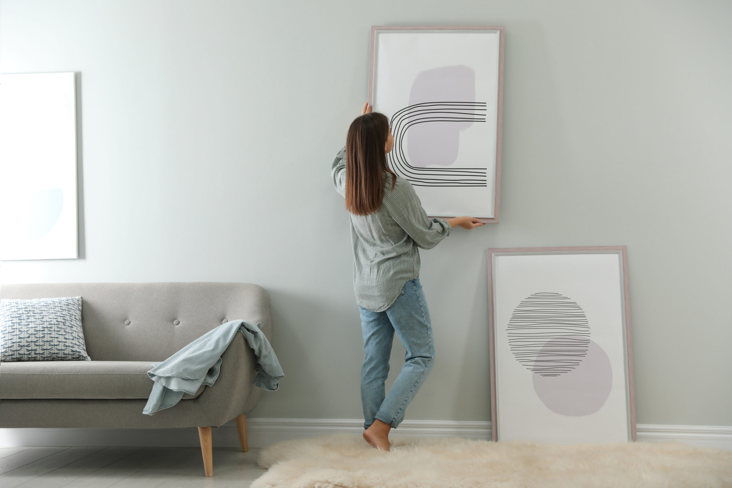
Think of the “average eye” when installing artwork or accent pieces. Often artwork is hung at the eye level of whoever is holding the hammer and nail, think of the average eye level instead.
- The most common mistake in artwork is placing it too high and, therefore, out of range for true appreciation. Whether it is a favorite child’s drawing or an heirloom passed down the family tree, place the middle of the piece about 63 inches from the floor. Often, we hang our home decor “gallery style,” rather than at a lower height that all can enjoy.
- When purchasing new art or decor, shop on trend and low budget! Why? These pieces will be easy to swap out once they’ve lost popularity and will allow you to keep the rest of your home’s personal palette intact. For big ticket items, buy what you love and will want to keep for a lifetime and let your access pieces showcase the current styles.
Moving into a new community is a wonderful opportunity to enrich a blank slate with personalized touches for every member of the household. Take it slowly, be intentional, and make sure you are decorating to the scale of each room. Chatham County’s Ryan’s Crossing neighborhood offers luxurious custom-built homes with generous footprints. With minimal upfront planning, buyers can avoid these most common design faux pas.
